
For over 20 years, Choice Furniture has elevated Singapore’s furniture market with its perfect blend of style and functionality. Each piece, from elegant marble dining tables to sumptuous Chesterfield sofas, showcases Choice Furniture’s dedication to quality, meticulously curated and rigorously checked overseas.
Yet, the online shopping experience hasn’t kept pace. To address this, I am revamping the Choice Furniture website to bridge the gap and deliver a seamless, intuitive online experience that matches the excellence of Choice Furniture’s in-store service.


Solo UX Designer
Four weeks timeline
Figma, Ai, PS & Google Suite
UX Design, User Research, Information Architecture, UI Design, UX Writing

As digital shopping evolves, the online experience often falls short of customers' expected seamless service. Recognising this, I am transforming the Choice Furniture website into a premier online destination.
Challenge
I aim to improve the online experience to match our in-store excellence. My goal is to empower customers to make confident, informed decisions while enjoying the same quality and service that Choice Furniture has delivered for over two decades.

Research Goals
Identify pain points and preferences regarding filtering and comparing products.
Gather insights on how users currently navigate the site and make purchasing decisions.
Conduct User Interviews & Surveys
Perform Competitive Analysis
Data Analysis
Analyse how leading e-commerce websites handle product filtering and comparison features.
Identify best practices and features that could be adapted for Choice Furniture.
Analyse site analytics to understand user behaviour related to filtering and product comparison.
Identify trends and common user paths that can inform design improvements.


In today's highly competitive digital marketplace, an intuitive and engaging user interface is crucial for any e-commerce platform. This comparative analysis evaluates the user interface and design, product presentation, search functionality, customer interaction and support, and e-commerce features of four prominent online platforms:
Researching the problem
78%


72%
66%
50%


50%
78%
- Comparative -
- Competitive -
In today's highly competitive digital marketplace, an intuitive and engaging user interface is crucial for any e-commerce platform. This comparative analysis evaluates the user interface and design, product presentation, search functionality, customer interaction and support, and e-commerce features of four prominent online platforms:


66%
52%
66%
70%
80%


80%
66%
User Research
User Interviews
12 Interviewers
Male & Female
Age >25
BTO homeowners need furniture & renovators seek upgrades
The user interviews revealed key insights


- User Personas -
Primary User Persona
Sulaiman
Syarif
Avid Traveller
Sulaiman, an entrepreneur married with children, is helping his 69-year-old father renovate his landed semi-detached home. Despite his efforts, he faces challenges finding bestsellers and new arrivals and making side-by-side furniture comparisons.
I wish there was a quick way to select a lounge chair for my father. I’d like the site to show me bestsellers and new arrivals so I can quickly compare and choose.
"


Can’t easily filter bestsellers and new arrivals
Can’t easily do a side-by-side comparison of furniture
Frustrations


Behaviours
Too busy to visit shops or do extensive selection; prefers site recommendations.
Prefers a one-time side-by-side comparison of sizes, materials, and colors to decide quickly.


Goals & Needs
Want to consider options that the site gives me such as new arrivals and bestsellers
Then, easily compare the different selections to make the right decision
Problem Statement
Sulaiman needs quick method to select a lounge chair for his father. He would like the site to give him a few options, such as bestsellers and new arrivals so that he can quickly compare between them to make a choice
How Might We
HMW easily identify bestsellers and new arrivals and quickly compare them?

Design prominent labels for "Bestsellers" and "New Arrivals."
Add a page where users can compare three shortlisted items side by side.
Solution Statement


Secondary User Persona
Jane
Ling
Artistic Nature Lover
Jane is a Marketing Design Lead, recently married, with a baby on the way, and will soon move to her new BTO home. She wants child-safe, stylish furniture at affordable prices but is finding it challenging to find the right pieces that meet all her criteria.
I need a quicker way to find furniture that matches my design for the new BTO home. With the renovation keeping me busy, I don’t have time to search extensively for the right style.
"


Not sure of the reliability of online furniture sites
It is hard to filter the furniture according to the criteria she likes.
Dimensions of the furniture are not clear
Sites may not allow the scheduling of delivery
Frustrations
Behaviours
Busy at work and preparing for a new baby, he prefers site recommendations.
Scheduling house renovation and coordinating furniture delivery by herself
Particular about the material and color of the furniture


Goals & Needs
Want to easily find child-safe furniture for a new home
Scheduling house renovation and coordinating furniture delivery by herself
Particularly about the material and colour of the furniture
Problem Statement
Jane needs a better way to find furniture that fits into the design she has for her new BTO home because she is busy with her renovation and does not want to spend too much time searching for the right furniture style.
How Might We
HMW select the right furniture immediately without going through the search process?


To simplify searches, provide multiple filters for sizes, colors, brands, and connectivity, along with higher-resolution images for reference.
Solution Statement


User Flows


Visual Identity


Information Architecture


Wireframes


Usability Testing
I have conducted a remote Usability Test with 5 participants, assigning them 5 tasks each. The participants, experienced with both online and offline furniture purchases, have successfully completed all tasks, achieving an average System Usability Scale (SUS) score of 80.5, indicating high usability and user satisfaction.
Users have navigated the site effectively, finding their desired furniture through filters, the search bar, and browsing. They appreciated the site's clean look, intuitive navigation, and helpful reviews. However, improvements are needed to make the "+" sign for closing filters and comparing products more prominent, and to remind users to enter their email address during checkout. Implementing these changes will further enhance the user experience.

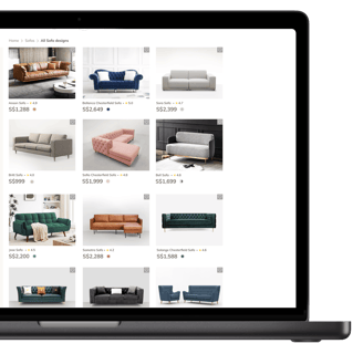
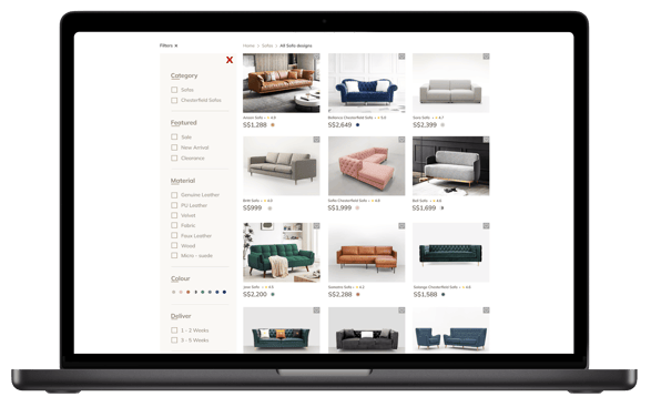
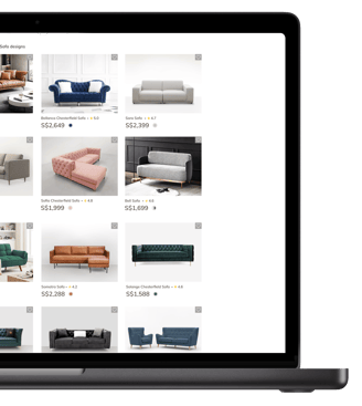
One user needed help finding the "+" sign to close the filter.
1st Discover
Proposed Solution
Improvements are needed to enhance the visibility and functionality of the "+" sign for closing filters. Additionally, the filter button should be made more prominent for better user accessibility.
2nd Discover
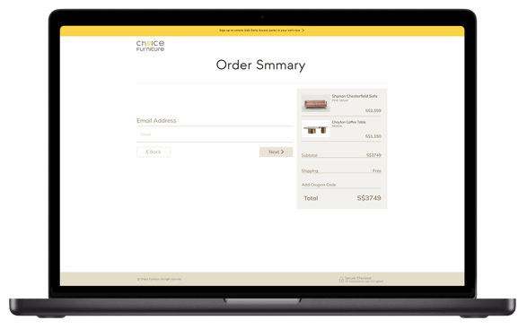
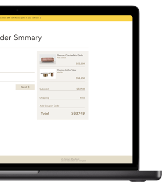
Another user forgot to enter their email address when making a purchase.
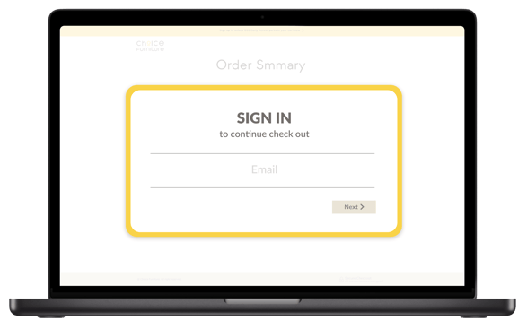
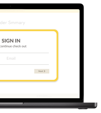
Display a pop-up window to prompt users to add their email address during the checkout process.
Proposed Solution
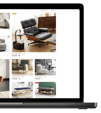
3rd Discover
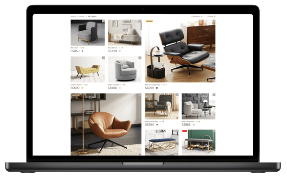
One user needed help finding the "+" sign to compare products.
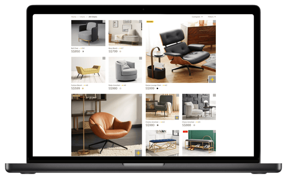

Proposed Solution
Make the "+" sign for the compare products button more prominent, rather than keeping it as a hover-over option.
Conclusion
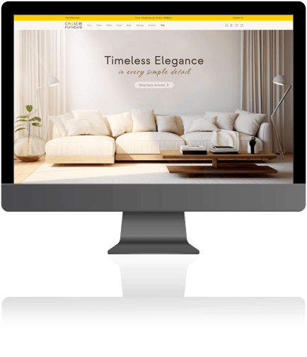

The Choice Furniture project successfully identified key areas for improving user experience, particularly in navigation, filtering, and post-sales support. Through competitive analysis, user interviews, and usability testing, the project highlighted strengths such as intuitive navigation, a strong SEO strategy, and comprehensive payment options.
However, it also revealed areas needing enhancement. Some interface elements, like filtering and comparison features, were not as intuitive, making searches and comparisons more challenging. Limited educational content and support left customers without sufficient guidance, while the checkout process required refinements for a smoother experience.
Enhancing product visualization with high-resolution images, interactive features like AR/VR, and showroom invitations would create a more immersive shopping journey. Addressing these areas will help Choice Furniture deliver a seamless, engaging, and customer-centric experience, fostering greater satisfaction and trust.
Final Takeaway
This project reinforced the importance of seamless navigation, clear product presentation, and post-sales support in enhancing customer satisfaction. By implementing these insights and improvements, Choice Furniture can create a more engaging and frictionless shopping experience, ultimately driving higher customer trust and conversion rates.


Future
Plan


