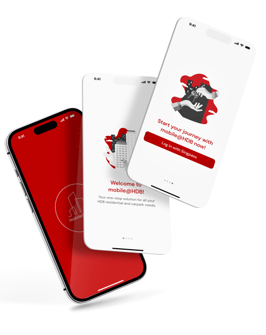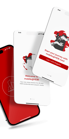
The Mobile@HDB app is Singapore’s digital platform for housing, business, community, and car park services under the Housing & Development Board (HDB). Designed to assist residents and stakeholders, the app has faced challenges with usability, including fragmented navigation, a cluttered interface, and difficulty in finding information.
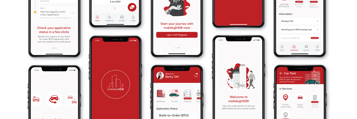
Aimed at addressing these issues, the redesigned app focuses on user-centric improvements such as personalised dashboards, step-by-step guidance, enhanced search functionality, and interactive tools like mortgage calculators and application progress trackers. It also consolidates essential resources, provides real-time notifications, and allows customisation for frequently accessed services.
This transformation seeks to create an intuitive, efficient, and reliable platform, empowering users to navigate their housing needs seamlessly while maintaining high trust and accessibility.



Team UX Designer (5 members)
Four weeks timeline
Figma, Ai, PS & Google Suite
UX Design, User Research, Information Architecture, UI Design, UX Writing






Challenge
The Mobile@HDB app is a digital extension of Singapore’s Housing & Development Board (HDB), offering residents and stakeholders a comprehensive platform for housing, business, community, and car park services. However, it has faced criticism for usability challenges.
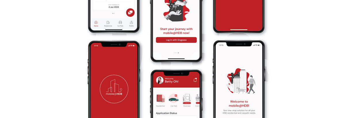
The revamped Mobile@HDB app is designed to become a dependable and efficient solution for Singaporeans managing their housing needs. It is set to evolve into a modern, intuitive, and user-centric platform by overcoming usability challenges, integrating user feedback, and introducing interactive features.
Objective
Personalized Dashboards
01


Step-by-Step Guidane
02


Enhanced Search Functionality
03


04
Interactive Tools


Centralized Information Hub
05
06
Real-Time Notifications



Overview of HDB


80
of Singapore's population
%
1
million flats


23
towns
3


estates
Conduct User Interviews & Surveys
Perform Market Evaluation
Consumer Insights
To benchmark the app against competitors and identify areas for improvement or innovation by comparing the Mobile@HDB app with similar platforms.
Identify gaps in the Mobile@HDB app, such as navigation or information consolidation, and apply best practices from successful apps to enhance the user experience
To gather direct feedback from existing users about the Mobile@HDB app's strengths and weaknesses.
Reveal real-world challenges and sentiments, acting as a pulse check for current user satisfaction.


Analysis Objective
To gain deep qualitative insights into user needs, pain points, and behaviours.
Uncover specific frustrations, desired features, and expectations to inform design decisions, while validating initial assumptions and refining personas
01


02


03
Through engaging with users, we gathered valuable feedback and uncovered actionable insights to inform our next steps. This process involved interviewing 38 Singaporeans aged 18 to 44 who had recently interacted with the HDB website or mobile app. From these interviews, we identified key patterns and observations.

The current Mobile@HDB app does not offer any value-add. It just keeps leading me to an in-app browser.
There is so much information everywhere, it’s hard to navigate and I’m still unsure about what I’ve read.
I think a step-by-step guide or a checklist for each stage of the HDB journey would have been very helpful.
I prefer to use my mobile for information-finding on the go or for the simpler services such as tracking my application status & straightforward transactions.
- User Voice -
Key Insights from Conversations with Our Users


User Interviews
Male & Female
Age 18 - 44
Recent HDB website or app users


38 Interviewers








To begin, the team performed an in-depth market analysis, benchmarking against leading industry platforms such as DBS Digibank, PropertyGuru, and government applications like SingPass, HealthHub, and CPF Mobile. The evaluation focused on key factors including functionality, user interface, and user feedback to identify opportunities for strategic enhancements.
Current Practices of
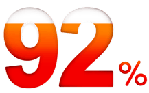
- Comparative -
Top Organizations
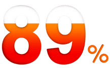

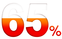




Mobile@HDB
PropertyGuru
99.co
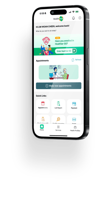
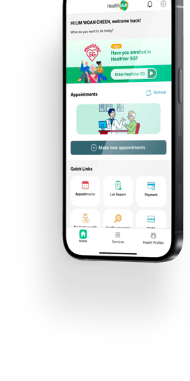
Streamlined and user-friendly, with quick access to personal health records and quick links on the homepage.
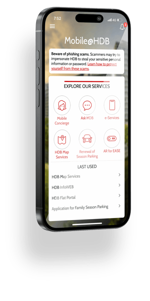
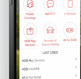
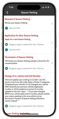
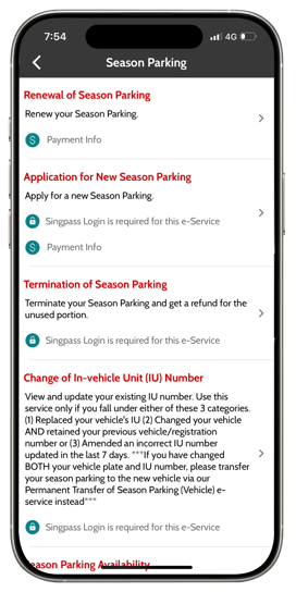
Comprehensive but dated, with confusing navigation and less relevant "Explore Our Services" links.

Mobile@HDB


HealthHub
Mobile@HDB
Most pages redirect to an in-app browser, making navigation difficult and requiring several clicks to find information.


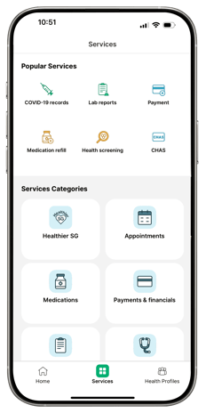
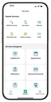
Seamless navigation through well-structured categories and a clean layout for easy access to health services and programs.
HealthHub


User Personas


We wish updates were automatic and tasks clear without digging for information.
“
"
30 years old
Accountant
Singapore
Married

Betty Oh needs a better way to track her BTO application because she feels overwhelmed and uncertain without step-by-step guidance on the process and documentation requirements.


An interactive BTO application roadmap that features a timeline. This includes a progress bar and interactive cards that reveal detailed information about required documents and next steps.


I need a simple way to manage our family's parking without sorting through scattered information.
“
"
34 years old
IT Manager
Singapore
Single, living with parents

Finds the current information on season parking fragmented and hard to understand.


A Car Park dashboard with e-services, season parking applications, detailed info, and a chatbot for quick assistance and renewals.


I want a hassle-free way to find all flat-buying information in one place without endless searching.
“
"
24 years old
Civil Servant
Singapore
Looking for new home with fiancé

Finds fragmented HDB information hinders her ability to gather essential details efficiently.


A 'First-Time Homebuyers Guide' with topic selection, bookmarking, and personalized calculators for grants, payments, and loans.
Design Process
User Journey Maps
To create a user-centric Mobile@HDB app, the team developed user flows for three personas—Marc Tay & Betty Oh, Peter Parker, and Jen Zee. These flows outline their journeys, from login to key tasks like BTO applications, season parking, and exploring housing options. The design is tailored to their needs by mapping these steps and improving navigation and user satisfaction. This approach ensured an intuitive and impactful experience.
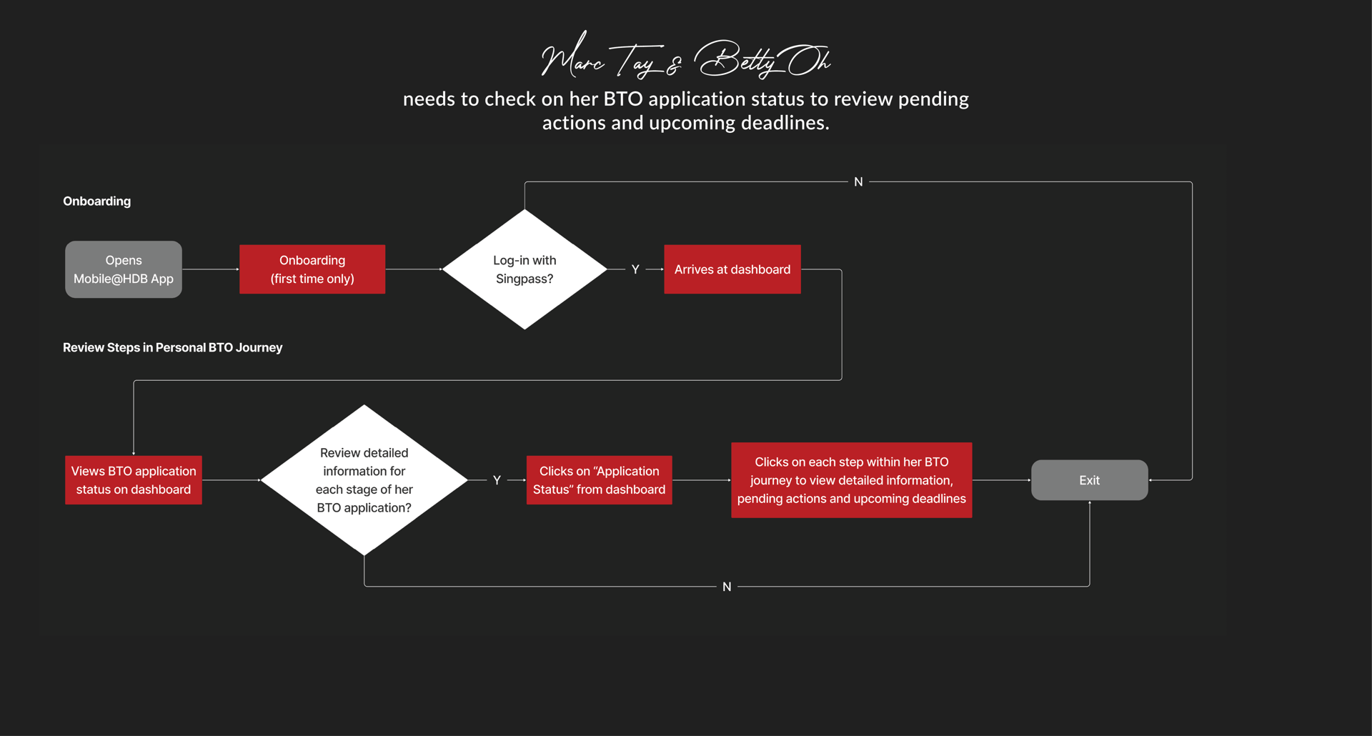
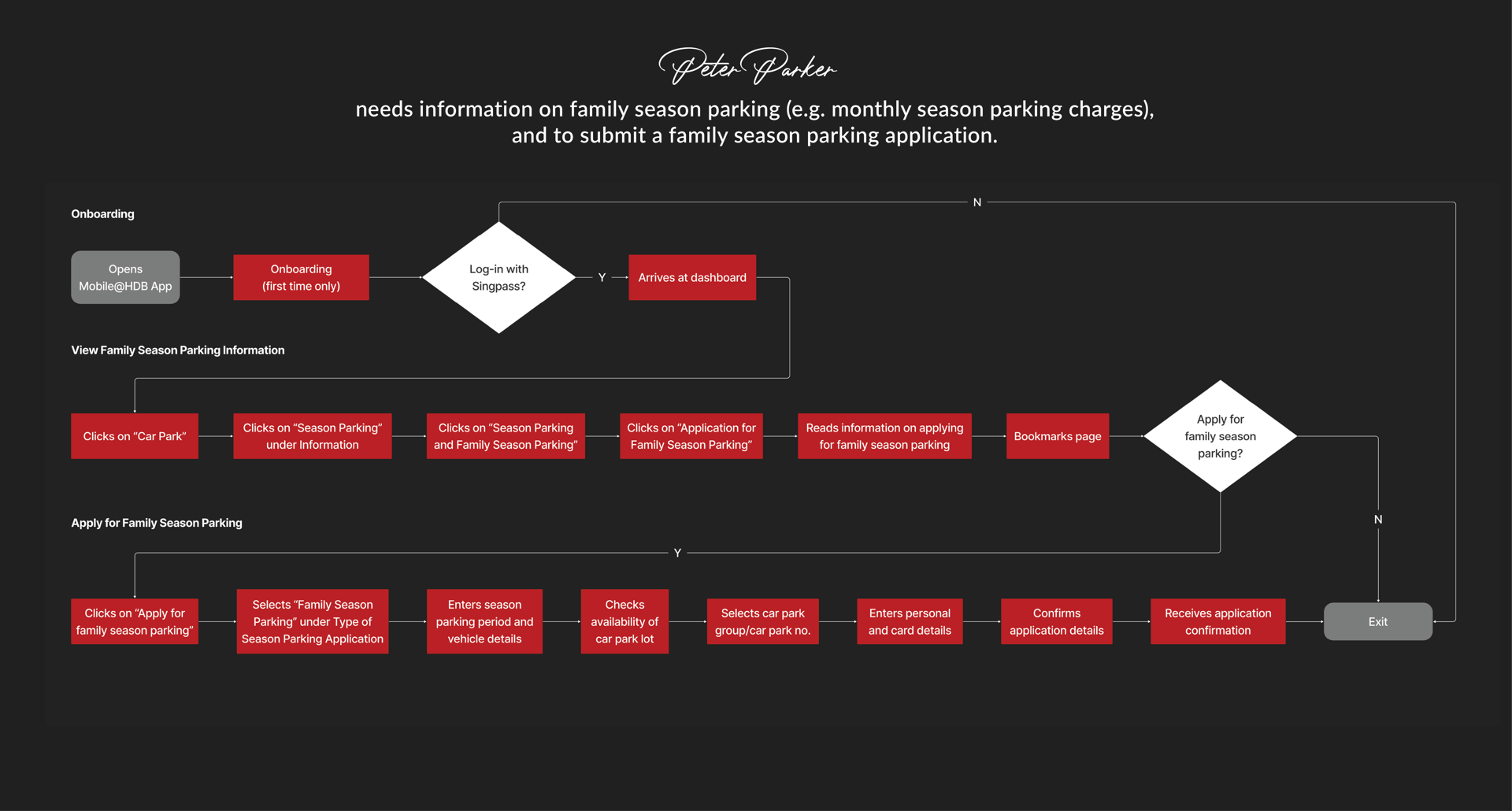
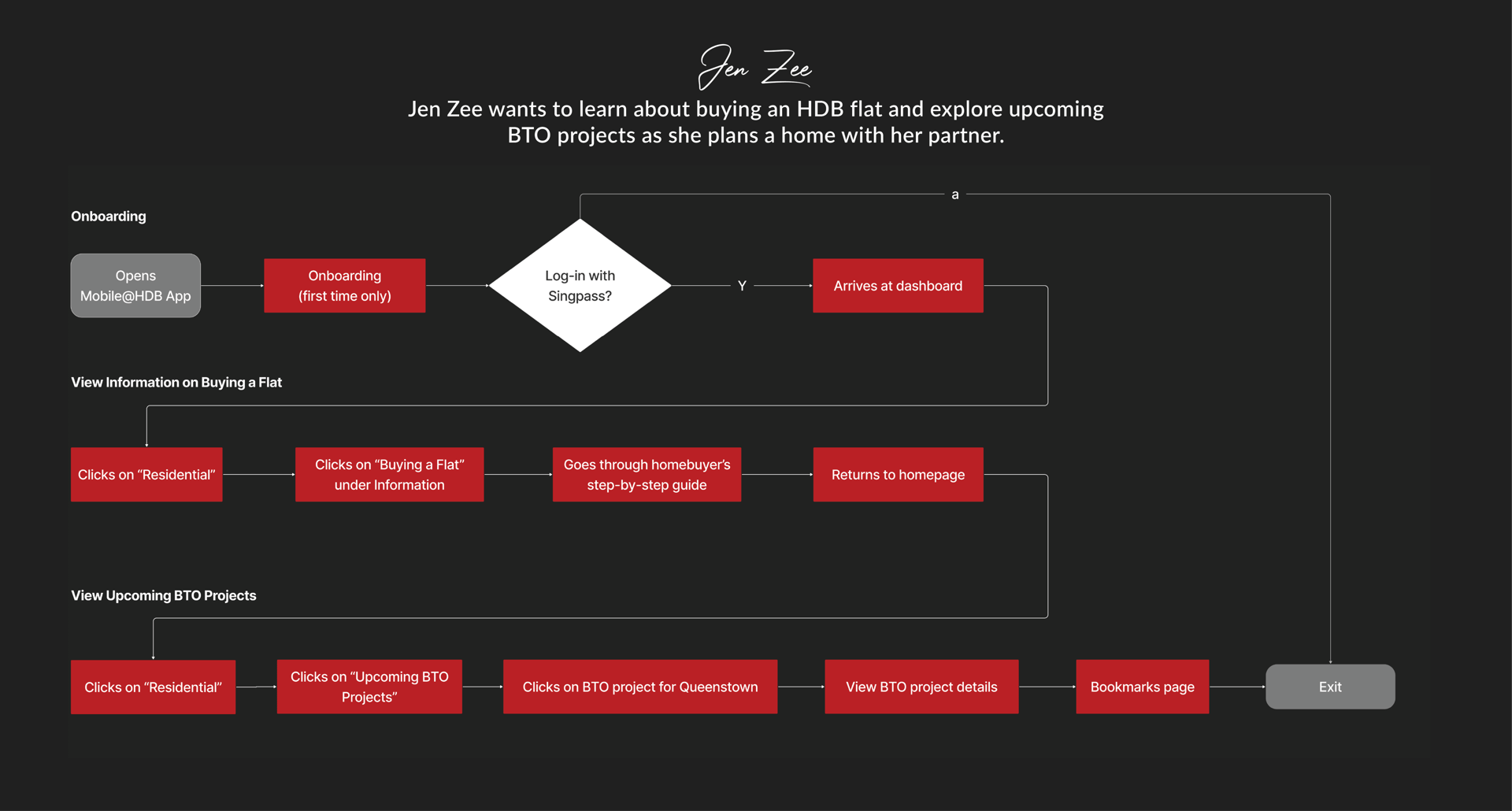
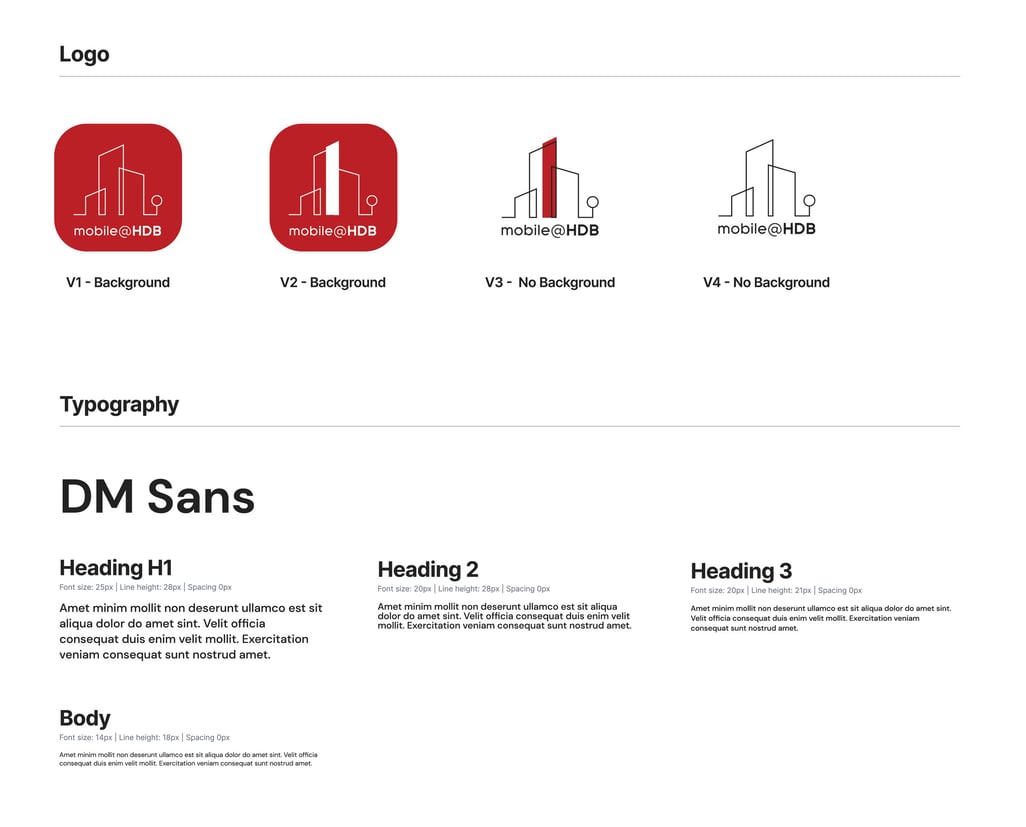
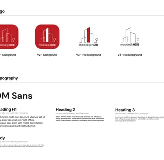
Our design system enhances the app’s visual appeal while staying true to HDB’s brand. We modernized its look using architectural-inspired elements, refined the color palette, and introduced a sleek new logo while simplifying typography for a cohesive UI.
Design System
Balancing Innovation and Identity
Usability Testing
User Testing & Insights
We conducted a remote Usability Test via Zoom with 12 participants, including BTO applicants, season parking users, and prospective homebuyers. Each participant completed 17 tasks to assess the app’s usability, resulting in a high System Usability Scale (SUS) score of 82.7. This reflects strong user satisfaction and ease of use. Additionally, the test provided valuable insights to refine the prototype, ensuring better alignment with user behaviors and expectations.
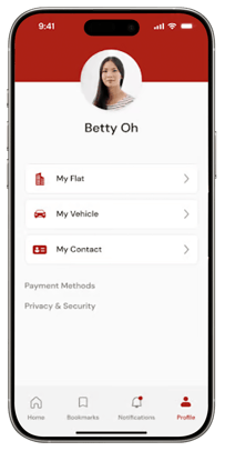
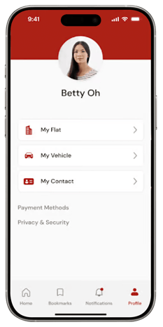
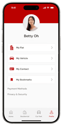

Some users expected bookmarks in their profile, similar to shopping apps, while others prioritized quick access to residential and car park pages. In response, we relocated bookmarks to the profile, moved notifications to the main dashboard, and updated the navigation bar with “Residential” and “Car Park” icons.
Optimizing Navigation for User Behavior
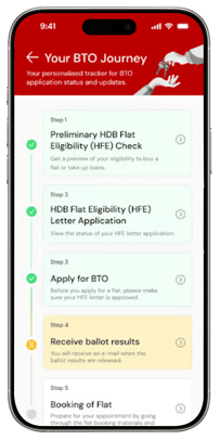

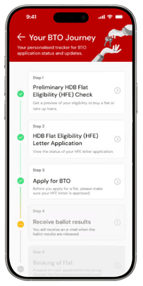

Greyed-out BTO Journey cards misled users into thinking they were disabled. We improved this by using white for upcoming steps (indicating clickability), green for completed steps, and yellow for the current step, making progress clearer.
Enhancing Usability Through Color Updates
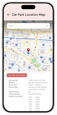

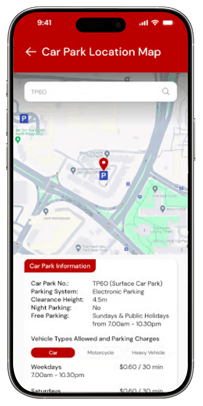

Users found the original car park map lacking key features. They wanted to view nearby car parks, tap icons for details, and see short-term parking charges. In response, we made icons interactive and added parking charges to the information section.
Enhancing Car Park Map Usability
Conclusion
Future Outlook
This project was both a rewarding challenge and an opportunity to rethink the Mobile@HDB app experience. Our vision was to transform it into a clean, modern, and highly functional platform, and the positive reception from usability test participants affirmed our direction. While we successfully addressed key pain points, we also identified areas for further improvement.
Future Plans






Short-Term Enhancements
Mid-Term Expansions
Long-Term Innovations
Our immediate focus is on refining existing functionalities to enhance user satisfaction and engagement. This includes:
Optimizing the user interface based on industry standards like the Singapore Government Design System.
Improving app stability and performance to ensure a smoother experience.
Implementing incremental design updates based on usability test feedback.
To further enhance the app’s capabilities and accessibility, we plan to introduce:
Additional financial tools to assist homebuyers in making informed decisions.
Integration of the Resale Flat Listing (RFL) service to streamline property searches.
Expanding device compatibility, including tablet support, to improve accessibility.
Looking ahead, we envision transformational innovations that leverage cutting-edge technology to redefine the housing experience:
AI-driven personalized housing advice to help users make smarter home-buying decisions.
AR-powered virtual property tours to provide an immersive home-viewing experience.
Predictive analytics to offer proactive recommendations based on user behavior.
By following the Innovation Continuum Framework, we ensure that Mobile@HDB remains adaptable, continuously improving to meet evolving user needs while shaping the future of digital homeownership experiences.

